Decorating with the color GREEN

Inspiration via Pinterest.
I have two paint palette options for my office and the one I’m leaning towards is decorating with the color GREEN. If you want to check out the other options, see how decorating with the color RED might be an amazing alternative choice.
I’ll be honest. The red idea was scaring me. There was one particular sunny day a few weeks ago and the light was streaming in through my office window… and I got totally worried that with a red-painted room it would feel like I was in the fire-y pits of hell. Umm… not exactly conducive to creativity and writing (at least not for me!)
I’ve always loved the color green. I love the way it makes me feel, I love plants and flowers, and I (vainly) love the way it makes my skin look while on camera. My hesitation with the decorating with the color green was that it felt safe. I’ve done it before. I decorated an entire studio for my client, Angela, in green (and loved it!). Would I still feel excited using a color that I’ve used in the past?

Inspiration via Pinterest.
The more I thought about it, the more I realized how incredible shades of red/rust/terracotta/pink/blush would look with green as the dominant color. I could still get my red-fix without painting the entire room. Additionally, there’s a difference between trying something new for the sake of doing it, versus actually trying it because you like it. After sitting with both the red and the green moodboards for a few days, I realized that I was trying to convince myself to go red simply for the sake of a “wow” moment on social media.
That wasn’t going to work for me. I was the one who was going to have to live and work in the room. And I wasn’t jiving with the color theory and feelings that are evoked with red-tones.
The final decision maker came when I was gifted a vintage mid-century modern dresser from a family member. MCM furniture has an orange undertone in the wood, which would look incredible against green.
I’ve never fully leaned towards a mid-century modern aesthetic, but it’s undeniably having a “moment” in the design world. I thought I could combine the MCM vibe of the vintage dresser with a more modern southwestern style that I’ve been drawn towards. Maybe it’s from living in Colorado; maybe it’s me drawing inspiration from the vintage desert painting I inherited from my grandparents; maybe it’s my marriage with Berto and wanting to honor his Mexican heritage. Either way, I’ve been loving incorporating just a touch of southwest/mountain into our home.
Here’s how I envisioned the color palette coming together:

Such a pretty palette. And again - I still get my red tones, just as a secondary and accent color instead.
I loved reading more about the color theory behind the color green. A lot of the words resonated with both how I want to feel, and how I currently feel in this season of life.


Growth. Prosperity. Energy. Revitalize. Success. Yes please.
Next up was grabbing a few paint samples and testing them out on the wall. I highly recommend doing this before painting, as a color may look wildly different in your home than at the store. Case in point - I used Liveable Green in a client project and it looked incredible. It was the perfect sage-green color. I painted it on the walls in my office…and it looked extremely minty.

Liveable Green on the left. Dried Thyme on the right. Both are Sherwin Williams.
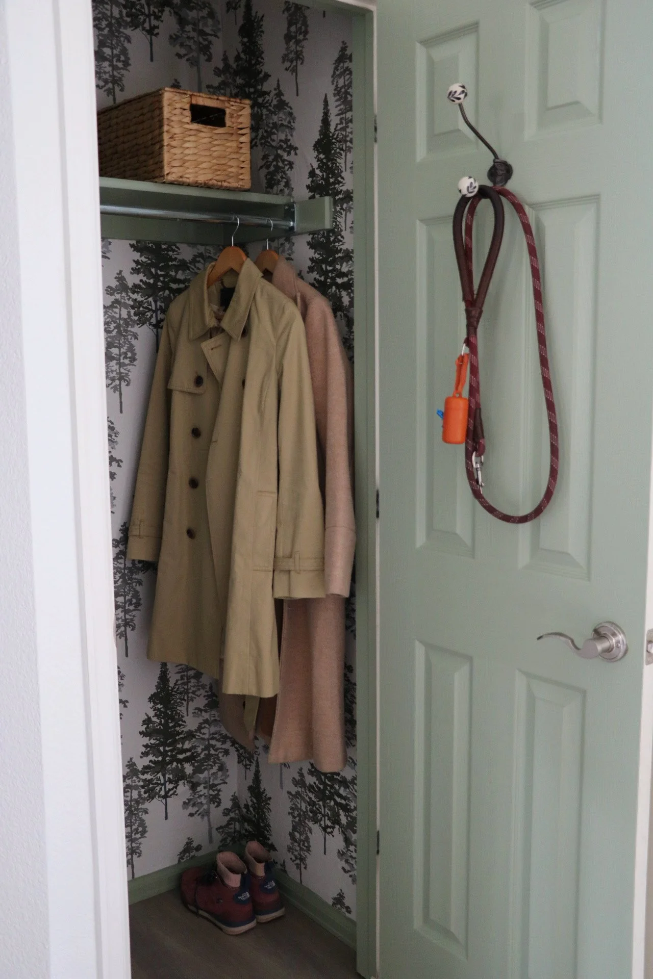
The darker color will be used for inside the closet for a future craft closet project, featuring a STENCILIT pattern. But in the case of the two paint swatches above, neither were quite right. Liveable Green was reading too minty and Dried Thyme was too dark and saturated.
I went back to the drawing board and decided on Clary Sage and Artichoke. After finishing up painting this week, I am SO EXCITED with how things turned out! Follow along on Instagram to see a sneak peek, and check back in later this week for a paint color reveal.
(Spoiler: I am really happy with my choice to decorate with the color green.)