Decorating with the color RED
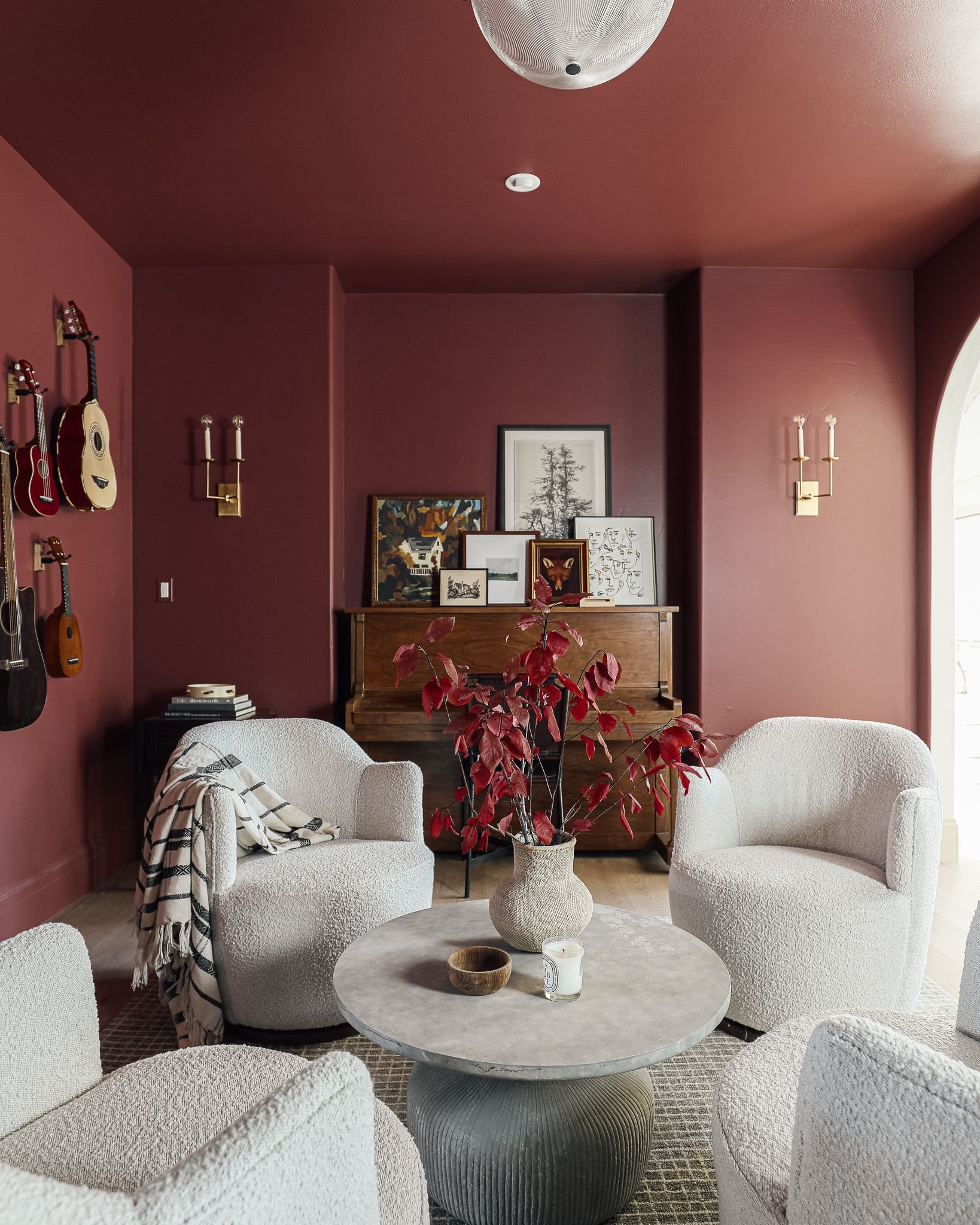
Image Source: Chris Loves Julia
Call me crazy, but I am seriously considering painting my creative office RED. Ever since seeing Chris Loves Julia paint their music room in the most gorgeous paint color, I’ve wanted to decorate with the color red. I think my jaw hit the floor when I first saw the room reveal. It’s such a bold and unexpected choice, absolutely perfect for this room in their house.
I tend to use Sherwin Williams for the paint colors in my home, so while this music room is in Benjamin Moore Fading Twilight, I looked at SW Toile Red as a comparison. The price points tend to be lower for SW, and there are multiple SW stores nearby (not to mention a Lowe’s down the street!)
But then… I saw another inspiration image that stopped me in my tracks…

Image Source: I Spy DIY
Are you KIDDING ME with this gorgeousness? While I typically don’t lean towards orange, what inspired me about this beautifully decorated room by I Spy DIY was the picture molding and the rich tone of the orange paint. My wheels started to turn on how I could take these two beautiful designs and find my own version. What would DIY Darling’s creative office looks like with these two rooms as inspiration?
The challenge of installing picture molding for the first time intrigued me. I liked the idea of adding a wood element that would add dimension to a fairly standard room.
I liked that with the picture molding installed, I could paint the upper third + ceiling in a creamy white, while still having a bold color choice for the bottom two-thirds of the walls.
But again… I don’t like the color orange. Red, on the other hand, is one of my favorite colors. And as I’d never decorated with the color red as the dominant color, I thought it would push me creatively as a designer.
Then Sherwin Williams announced their 2023 Color of the Year: Redend Point.
And while it’s not a saturated red like Chris Loves Julia music room, I thought it could be my version of a red room. After painting Berto’s office a dark and moody color, I wanted to go a bit lighter for my space. I have a fabulous window with views of the Rocky Mountains, and I get a lot of afternoon sun. I looooove natural sunlight and have realized I prefer being in a brighter room when doing creative work. So perhaps Redend Point was my answer to exploring decorating with the color red, without making it a supersaturated choice.

Image Source: My Scandinavian Home
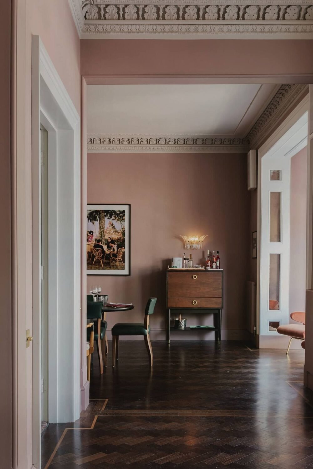
Image Source: Studio Duggan
I sat on this idea for quite a while. I toyed around with complementary colors, with existing art and furniture I owned, ruminating on how it would all go together.

Complementary colors with a muted red palette.
And then I started to get worried. After working in my office for a few weeks, I noticed that the afternoon sun reeeeeally comes in. Would red-painted walls reflect the light and make it look like I was working in the pits of hell? And on that note, how would the color red make me feel? As a creative, the way I feel drastically affects the work I do. It’s an important factor to consider. So, I did a deep dive into color theory:

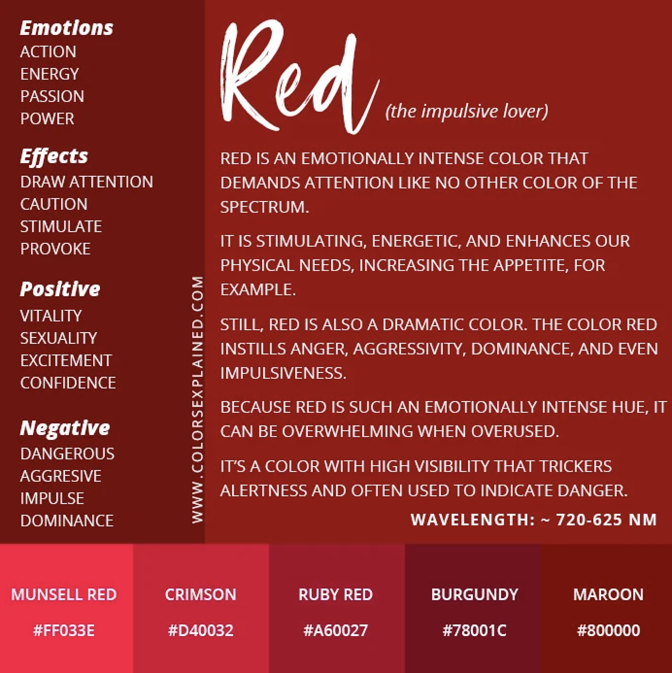
Of course, keep in mind that the tones of Redend Point lean more earthy and muted, evoking emotions like warmth and empathy. But dang - did I really to mess with the potential negative effects of the color red? I wasn’t so sure. I needed to see what it would look like all together. I pulled out my trusty color wheel and noticed that green or sage was a beautiful complement to shades of red.

Image Source: DIY Darling
A moodboard was in order.
I’ve said it before and I’ll say it again, making a moodboard is a MUST when you’re planning out and decorating a space. They’re fun to make and they really help organize your thoughts.
Shown in the moodboard here are the things I already own, mixed with the paint color and other finishes. I have a beautiful vintage oil painting that I inherited from my grandparents that depicts a desert scene, as well as a mid-century modern dresser. I’d already purchased a new flushmount light to replace the boob light (truly cannot WAIT to install it!)
The last step to deciding on the paint color - getting samples and painting swatches on the walls. Paint colors can look drastically different depending on the lighting and a color that may have worked in your old home could look bizarre in your new one.
Note that the darker color will be used for the inside of the closet with a stencil from STENCILIT for an upcoming gifted post!

Paint swatches for my creative home office.
Here’s where I leave you for today. Letting paint dry and deciding if I want to go for it. Check back in to see the surprising result I decided on in Part Two!